Color Psychology in Gulf Luxury: Navigating Orange, Amber, Slate & Arabian Earth
Deconstructing the emotional palette of modern Saudi brands: Balancing the energetic glow of sunset amber with deep architectural obsidian black.
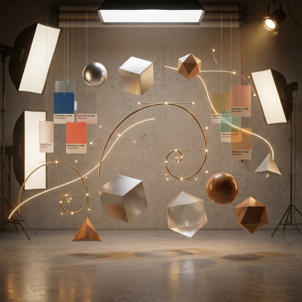
Color is the single fastest emotional trigger in visual communication. In the Gulf region, colors carry profound cultural, spiritual, and climatic connotations that global design textbooks frequently misinterpret.
1. The Energy of Sunrise Orange & Sunset Amber
At Elevate, our signature energetic palette utilizes #FF5500 (Signal Orange) and deep incandescent ambers. In Arabian geography, warm glowing hues represent desert warmth, hospitality fires, and the dynamic dawn of a transforming nation.
2. Obsidian Black and Midnight Slate
To prevent high-chroma orange from feeling industrial, we ground it in architectural obsidian black (#050508) and midnight slate. This stark contrast mirrors the desert night sky, creating an aura of extreme luxury, exclusivity, and technological focus.
3. Cultural Color Traps to Avoid
We avoid generic pastel tones and low-contrast palettes that wash out under intense Arabian sunlight and mobile screens, ensuring your brand stands proud in high-ambient lighting environments.
Ready to Elevate Your Market Presence?
Partner with Elevate to translate these strategic frameworks into cinematic commercial films, proprietary web OS, and institutional market authority.